Brochures, Posters, Stickers, Landing Pages, Email Templates, Logo Design, Apparel Design, Patches
Brochures, Posters, Stickers, Landing Pages, Email Templates, Logo Design, Apparel Design, Patches
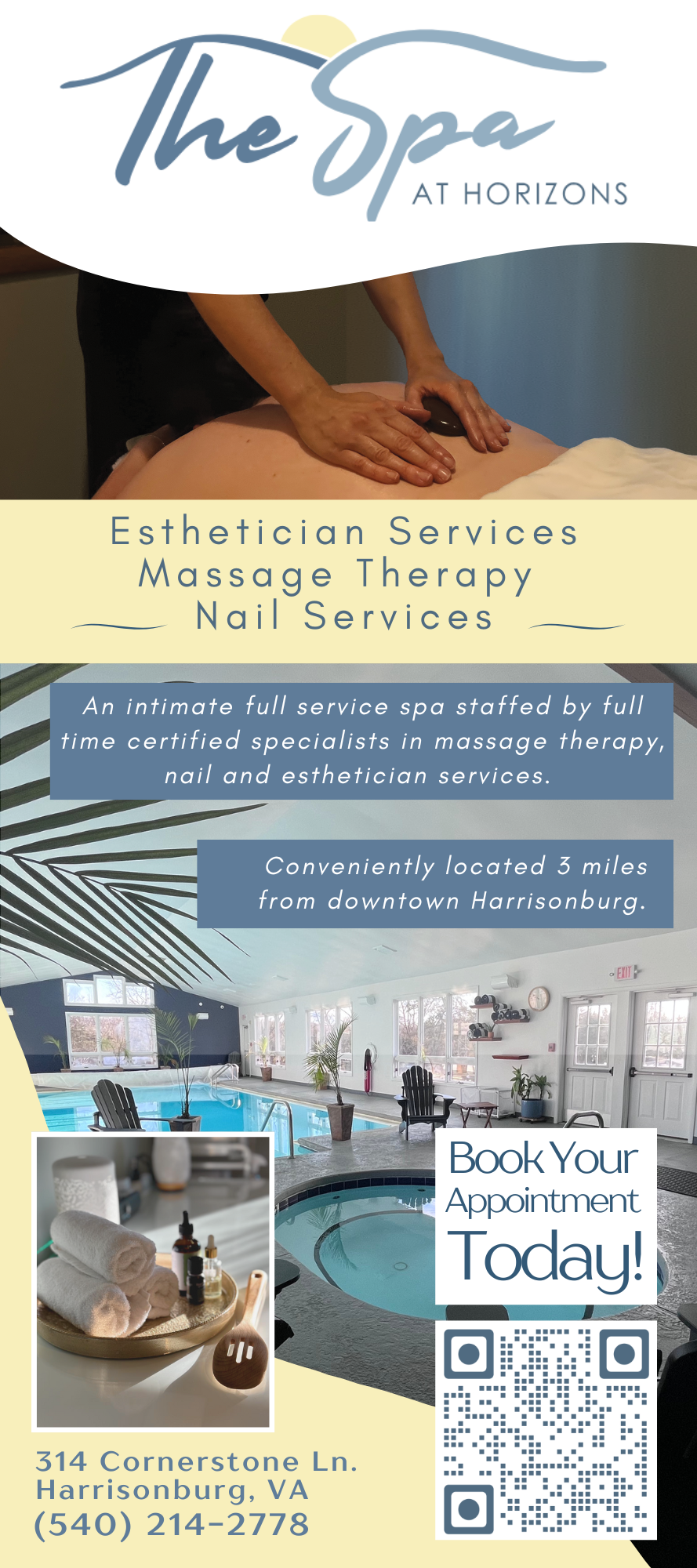
The Spa At Horizons
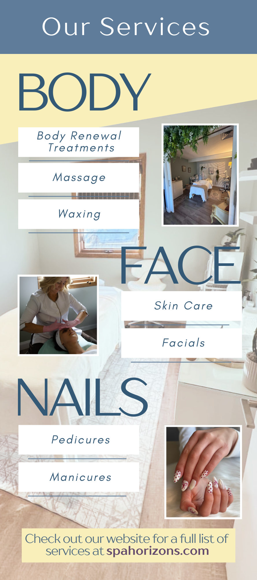
I was asked to design a fresh, clean brochure for The Spa that would clearly present their variety of services. My approach always begins with the basics of getting to know the brand and then identifying the key area’s that make them stand out from compretition. For The Spa, these were massage therapy, Body Renewal Rituals, Foot Care, Nail Services, and Facial Care.
From there, I used their brand guide to pick out colors and develop a design concept that reflected the spa’s relaxing atmosphere. Focusing on a clean, fresh and calming aesthetic. I chose a minimalist layout, using bright airy photos alongside a soft color palette. I incorporated subtle visual cues, such as section dividers and iconography, to guide the reader naturally through the content.
Choosing my photos to highlight the unique amenities, such as the pool and hot tub, in a way that complemented rather than cluttered the main service listings.
The final design felt inviting, easy to navigate, and reflective of the spa’s brand identity, ensuring that every element worked together to create a cohesive and calm brochure.
NROCKS Outdoor Adventures
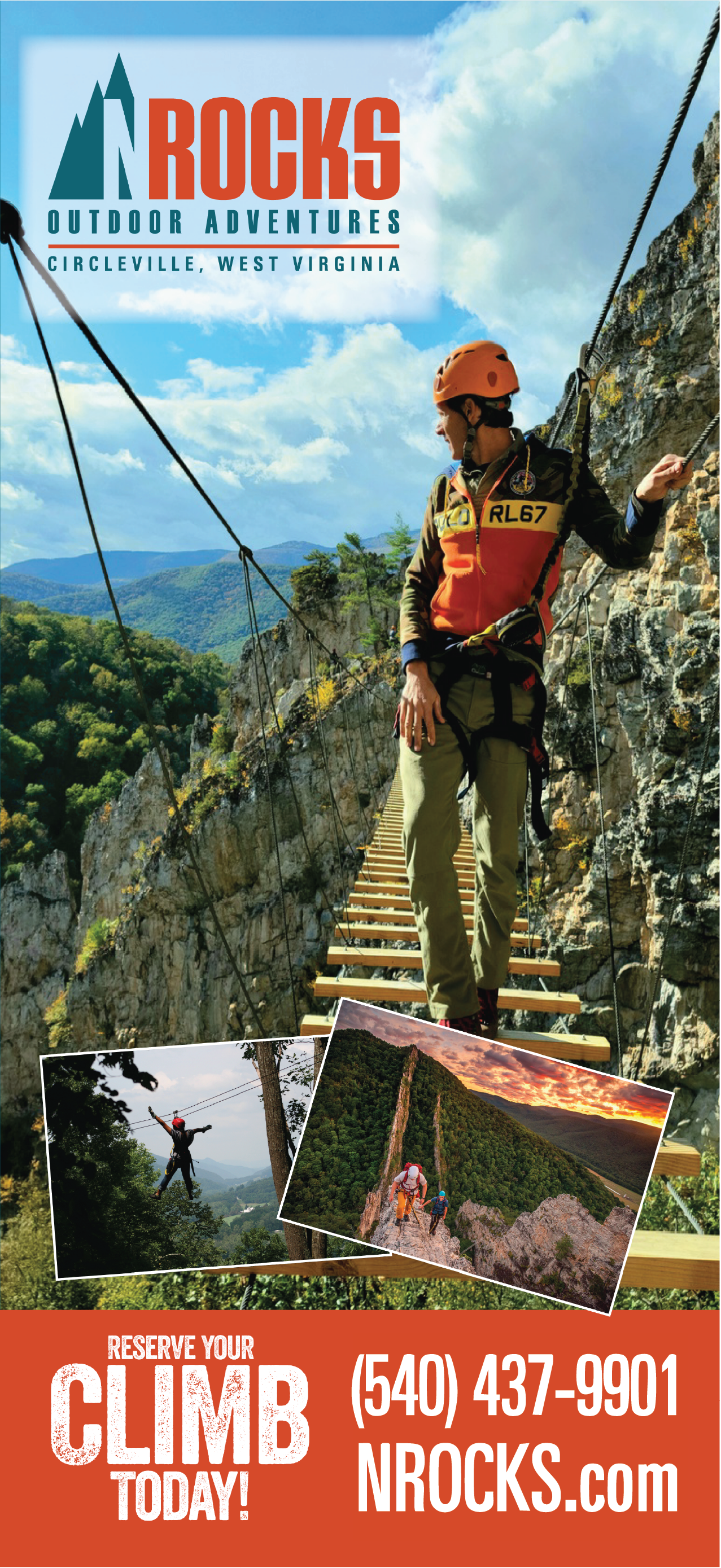
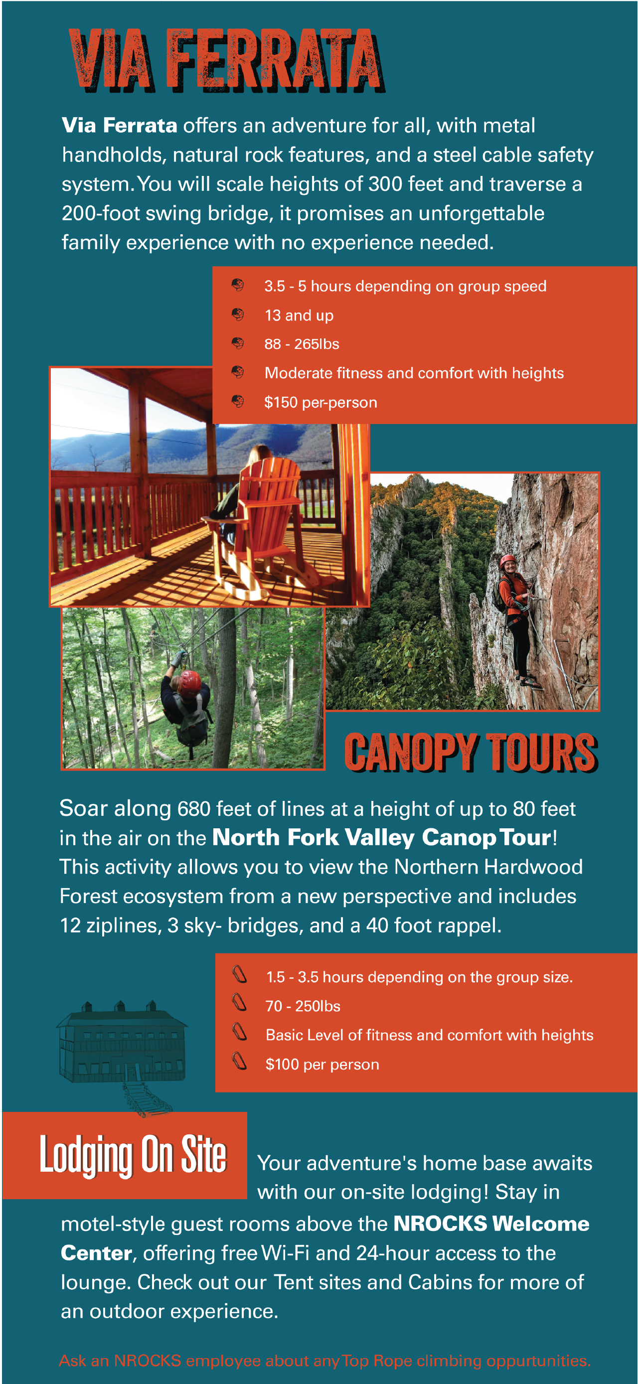
NROCKS Outdoor Adventures is a premier outdoor recreation center located in the scenic Appalachian Mountains of West Virginia. It is a top destination for adventure seekers, families, and groups looking to explore the wild beauty of West Virginia. Again here I met with the team to go over their expectations and requirements for the content of the brochure and then focused on the large selling points for this business, the CANOPY TOUR, the VIA FERRATA and the ZIP LINE.
After this initial overview I focused on what I wanted to convey to a person picking up this brochure. What are the highlights of this kind of experience? Excitement, adventure, amazing views, and that there is something for most individuals dependent on their ability and desire for excitement. I also made sure to convey a level of professionalism that every tourist wants to see whenever planning a nerve wracking experience. The result was a use of the bright colors alongside fun eye catching type choice with an organized layout of the each potential experience and breathtaking photos that are not anxiety inducing, showing fun and serene experiences.
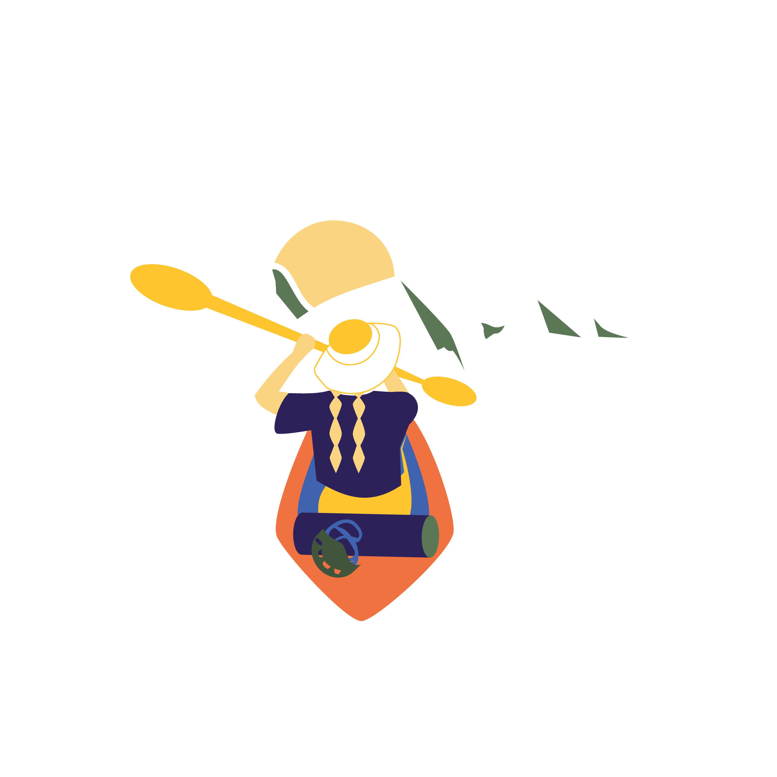
This same level of serene , but inviting design approach was used to illustrate and create the sticker that went alongside the brochure.
Camp Horizons: Adventure Camp
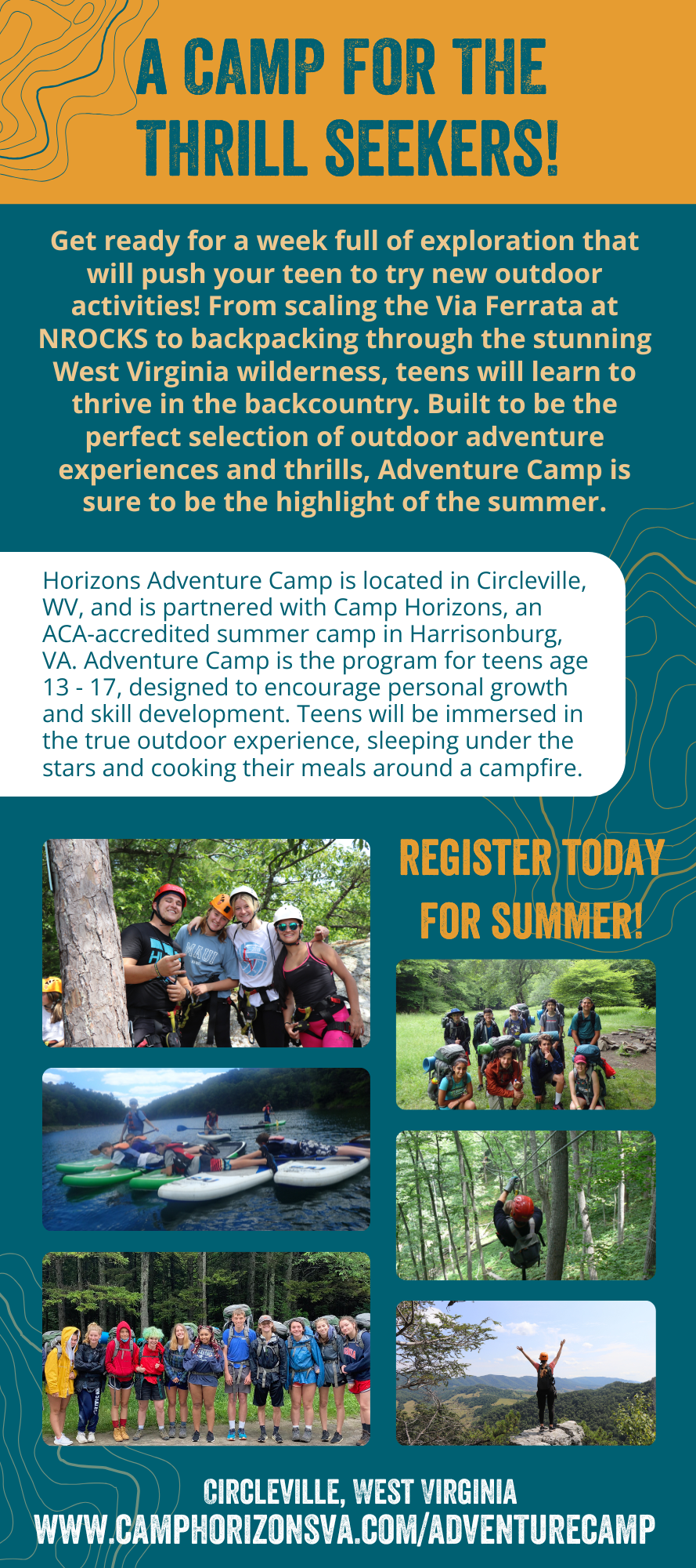
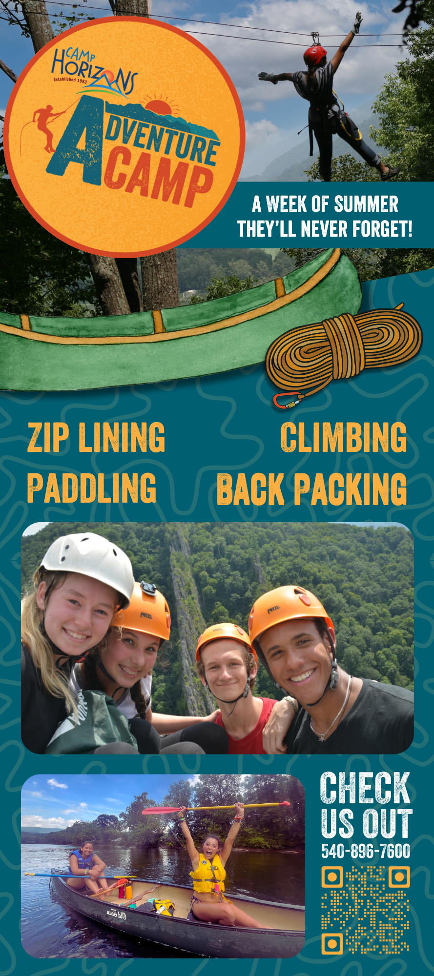
Camp Horizons has been around for almost 40 years and being located in the beautiful Appalachian Mountains as well as being connected to NROCKS it makes perfect sense for them to have an Adventure Camp. This dynamic, week-long outdoor adventure program for teens allows them to test their limits, build skills, and connect deeply with nature. Whether scaling cliffs, backpacking through the wilderness, or navigating by starlight.
When designing marketing materials for children’s activities, it’s important to strike a careful balance between fun and safety. The primary goal is to win the approval of the parent, while also creating something that will catch the eye of the teen once the parent shares the brochure with them.
This project was especially meaningful for me, as I was involved from the very start of the camp’s creation. I developed the logo, much of the branding, and the overall visual direction. I drew inspiration from both NROCKS and Camp Horizons, overlapping their colors and fonts to create a visual identity for the Adventure Camp that felt familiar, yet distinct.
The brochure incorporated a playful, whimsical touch through bright colors, fun illustrations, and photography that emphasized safety, seen through the use of helmets and harnesses, without sacrificing a sense of adventure. I also wove in a subtle ’90s-inspired aesthetic, a style currently making a comeback, to appeal to teenagers. The challenge was ensuring the design felt mature enough for teens and their parents, while avoiding anything that appeared too childish.
Camp Horizons: Equestrian Day Camp
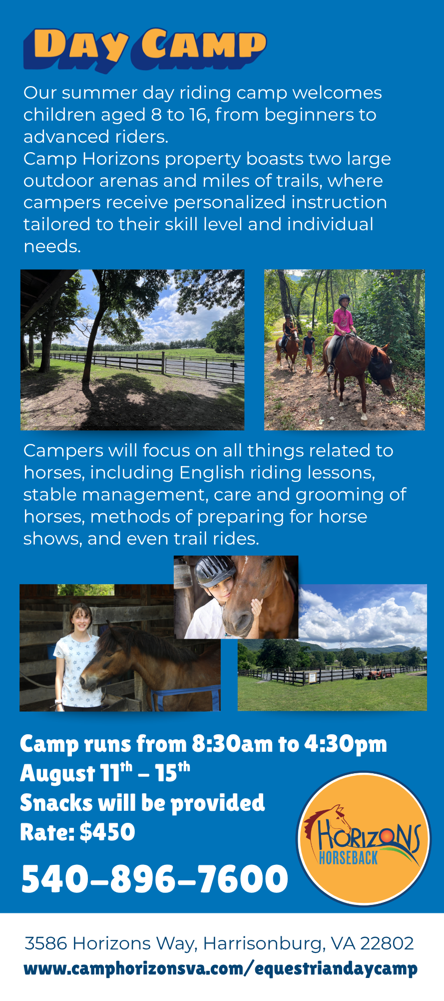
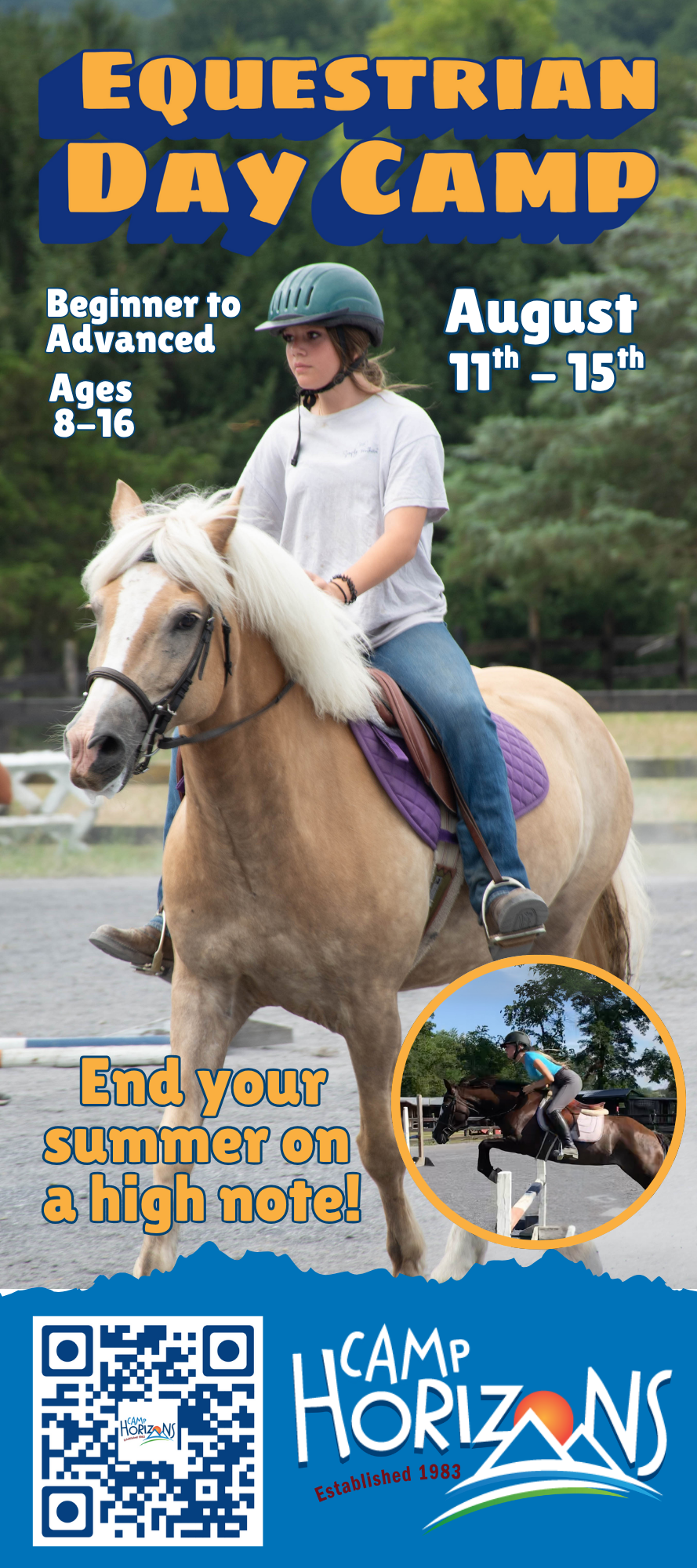
Horizons Equestrian Day Camp was a particularly special project for me as a young woman who grew up around horses. Through this work, I developed close relationships with many members of the Horizons Farm team and enjoyed spending time at the farm, getting to know them while collaborating on the design.
Much like my work for Adventure Camp, I was deeply involved in shaping the aesthetic for both the Equestrian Day Camp and the newly developing Horizons Horseback program. The logo I was tasked with creating, closely incorporated the original Camp Horizons mark, maintaining its playful, childlike illustrative style while giving it an equestrian twist to align with the program’s identity.
The programs themselves are set in the heart of Virginia’s Blue Ridge Mountains, offering a full spectrum of horse-related activities; English riding lessons, stable management, horse care and grooming, show preparation, and even scenic trail rides throughout camp.
For the Day Camp’s brochure, one of the key objectives was to clearly convey that the programs are welcoming to riders of all skill levels. I emphasized this through my choice of imagery and content, selecting photos that showcased both beginners and more advanced riders. To ensure brand recognition, I worked within the established Camp Horizons color palette, focusing on three primary hues for consistency across future materials.